Layout
Even though I have looked at multiple magazines before, I don't see a specific layout that music magazines tend to use when making their layout. In general, music magazines tend to follow that same trend, so I'm left with a wide variety of layouts to choose from in order to make my magazine.I found a great article about magazine layouts in general. Fresh Ideas for Improving Your Magazine Layouts included a variety of tips that help catch the reader's eye and keep their interest as they are flipping through my magazine. One of the main messages that I got when reading the article is that the magazine is not all about the cover page. I've been putting a lot of thought into what I want my magazine cover to look like that I hadn't really thought what I wanted my table of content and double page spread to look like. This article reminded me that it is not all about the cover. Yes, the cover has a lot of importance because that is what the reader is going to first see and it's what they use to determine their decision to keep reading the rest of the magazine, but the article and the design of my double page spread are equally as important. I need to make sure that my magazine keeps the reader's interest until they reach the very last page. Therefore, this article helped me refocus on the importance of the magazine as a whole rather than individual parts.
So after reading this article, I decided to head to Pinterest to see different images of music magazine layouts. These are my favorites out of all the images that I found.
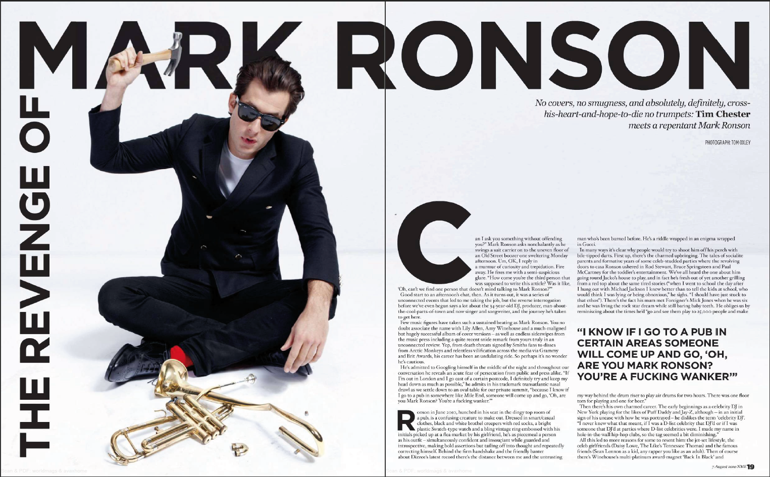
The picture of Mark Ronson is big and bold, along with his name printed along the top of the pages. Based on the picture and the enlarged title of Mark Ronson's name, I can guess without even reading the article that this story is going to be an anecdote about Mark Ronson. The title is placed in an unconventional way that forces the reader to look all over the spread in order to read the whole title. The placement of the title is interesting because it is not your standard title that goes across the page from left to right. I think that unconventional title placement catches the reader's attention quickly and piques the readers' curiosity in order to get them to read the rest of the article.
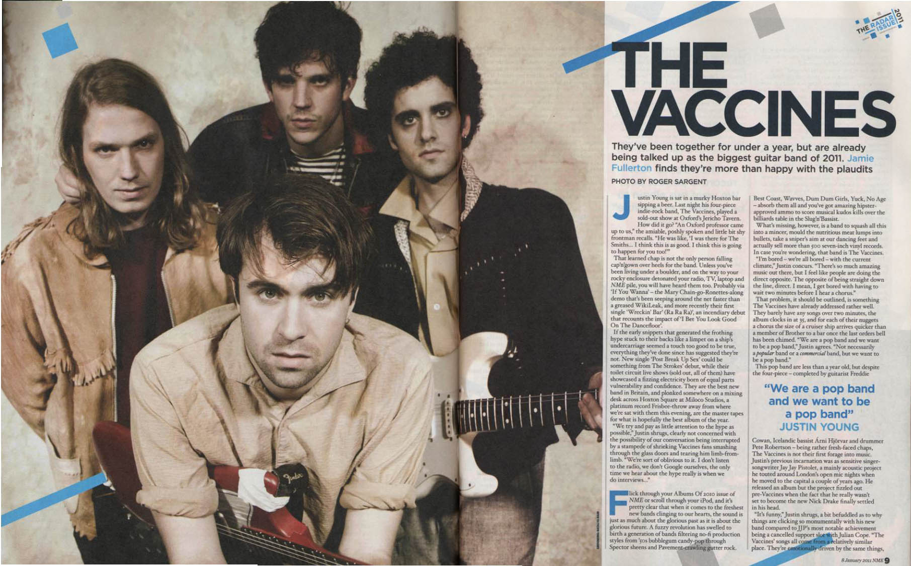
I like how the band photo takes up the majority of the double page spread. They are featured prominently, right in the centerfold so that readers who are flipping through know that the band featured is so important. The structure of the actual article is easy to read and has a logical flow to it. Majority of the room on the page is given to the picture and the article is there as support. It is clear that the main focus in this spread is about the band, not the article, which I would argue is exactly the opposite of the Mark Ronson spread above.

I like that the quote is prominent. It's also ambiguous enough to interest the reader to look at the rest of the article to understand a better grasp of what the title is trying to convey. Unlike the spread above about The Vaccines, the quote is enlargened to draw attention and show importance to the reader. Focusing on the quote rather than the band conveys that the magazine is focusing more on the band's lyrics or the messages that they are trying to convey through their songs.
What do I want to do?
I like the unconventional title placement from the Mark Ronson double page spread. It makes the spread more interesting to look at and it is a quick and easy way to draw the attention of the reader. I think I want the double page spread to be promotional and introduce the band to the rest of the world. Therefore, I am going to put a lot of effort into the photos and make sure that the band is placed prominently.
Resources
“5 Pro Tricks to Instantly Improve Your Magazine Layouts.” InDesign Skills, Designlisticle, 27 Mar. 2018, www.indesignskills.com/inspiration/magazine-layout-design/.
“Pin by Jamison Franzen on ART 3204 Audit | Pinterest | Magazine, Magazine Design and Editorial Layout.” Pinterest, in.pinterest.com/pin/478507529145381655/?lp=true.
No comments:
Post a Comment