Sunday, April 7, 2019

"One night and one more time. thanks for the memories" - Thnks fr th Mmrs by Fall Out Boy

Reflection

Today I will be discussing my foundation portfolio project, which is a rock magazine named Distortion. The reason why I chose this genre for my magazine has to do with the fact that I am a singer in the band Fluorescent Adolescents, who is featured on the cover of my magazine. I wanted to create my magazine about something that I was passionate about and the first thing that came to mind was my band. So here is my cover, table of contents and my double page spread.

The name DISTORTION came to me at band practice one day. I had been debating for a while what I wanted my title to be. I had come up with names like Sound Waves and Vibes but I didn’t like how it wasn’t clear what the magazine genre was. Then at practice, my guitarist Gabe was messing around with his soundboard and told me how much he loved how his guitar sounded with distortion. In music, the guitarist can use a soundboard to turn on the distortion of a guitar in order to make their music sound heavier and more powerful. Distortion on a guitar is a sound most associated with rock music which is why I thought it worked as an effective title for the magazine.

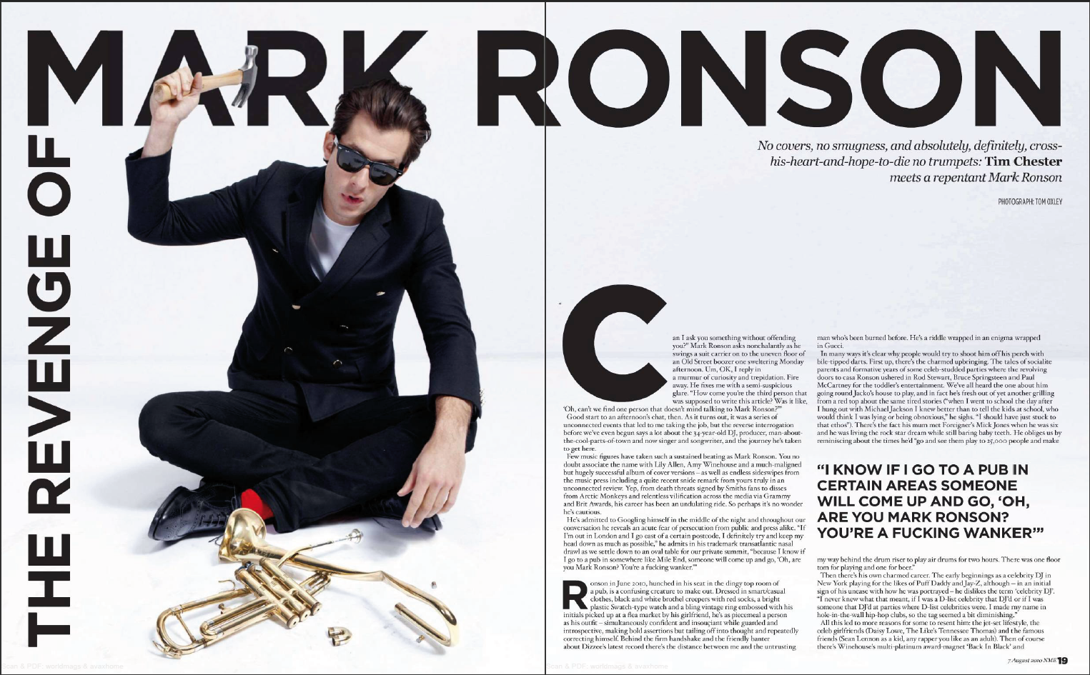
I utilized genre conventions when designing the front cover of my magazine. First off, the image that I used of my band is a mid shot. Most magazines use mid shots or close-ups of the artists in order to showcase the artists prominently. I originally wanted to go with a full shot that I had taken of the band, but it didn’t follow conventions so ended up switching to the image I have now.

My cover challenges many stereotypes about what the typical rock band should look like.

It was important to me that my magazine showcase diversity within the band and Fluorescent Adolescents were the perfect fit. The members of the band come from various background but they all come together to do something that they all enjoy doing. The diversity of my band challenged conventions because most artists and band don’t have such a wide range of members from multiple backgrounds and cultures. Having a diverse band on my cover is important to my magazine because the artists represent different groups of people who are united for their love of playing music. Through the images, DISTORTION targets multiple ethnic groups within my young adult target audience.

DISTORTION engages the audience with its various images. My cover image of the band establishes a connection with the reader through direct eye contact with the camera. Along with the enticing cover photo, I added more artistic photos such as the image on the table of contents page in order to attract the reader. Some of the artistic photos of the band included in the double page spread, such as this one, were taken by my friends at the Hit Music Studio. They gave me permission to use two of their photos for my magazine. I was important to me to have a wide variety of photos in my magazine in order to keep the reader’s attention as they read the entire magazine.

I also put my cover lines in multiple colors so that they would pop out at the reader and attract their attention. I crowded the front cover with cover lines because most other rock magazines tend to fill their space with cover lines as well. In order to make the coverlines, images, and background of the magazine look cohesive, I tried to stick with a color scheme of dark red, white, black and grey. By following this color scheme, certain images that don’t follow this theme create discordance and therefore attract the eye of the reader. Hence why using a color theme helps to engage the audience throughout my entire work.

I wanted to take a moment to explain why I included an advertisement next to my table on content instead of making it a double page spread. While I was researching about magazines, I discovered how important advertisements are to a magazine. As a consumer, I barely notice them and flip to the next page when I see an ad, but for a magazine, these ads are a major source of revenue. I wanted to make my magazine as authentic as possible and I noticed that most rock magazines limited their content to one page in order to leave room for an advertisement. Including ads is important, while it may not be seen that way from the consumer’s perspective, ads are a fundamental part of creating a magazine.

My production skills developed immensely throughout the last few weeks. Creating this magazine taught me a lot about the various steps that publishers must go through before they can create a magazine. Initially, I thought that anyone could throw a magazine together. All they have to do is take a few pictures for the cover, design a table of content and write up an article, but I realize now there is much more thought that goes into that process. Before I could figure out what pictures I wanted to take and what I wanted my article to be about, I had to design and plan my table of content first because it served as a roadmap to figure out where I was going with my magazine. Once I made that, I was able to better plan out the article I wanted to write and therefore the pictures that I needed to take.

I also had to research different rock magazines and specific subjects reader’s look for in these kinds of magazines. I learned a lot about genre conventions that are used in a rock magazine. Things that I thought were minute, unnecessary details, like the font used throughout the issue, ended up being the factor that made my magazine look polished and cohesive.

Another way my production skills developed was through using Joomag. I had never heard of nor used Joomag in my life. I will say, it was a little frustrating at first because I couldn’t figure out how to do anything. However, after watching a few instructional videos, I was able to figure out how to navigate my way through the software. I actually love Joomag now because I was able to edit my magazine down to the finest detail, such as deciding the spacing between letter in my coverlines.

Before this project, I would have said that I was pretty technologically savvy but as the weeks went on, I realized I was only proficient in certain software. Being introduced to completely new apps such as Joomag, really threw me for a loop and I quickly had to learn how to use the software given to me in order to get my magazine started. I integrated technologies by using different software to make my magazine. I used Joomag to layout and design my magazine. For my photos, I edited them using Pixlr and Befunky software to change the tints and cropping the photos. I also used various hardware or laptops throughout the process because I would work on the project both at school and at home.

Overall, creating this magazine taught me so much about marketing and graphic design. I can honestly say that I have a newfound respect for those who make a career out of creating and designing magazines. I really enjoyed making DISTORTION


"Where's the good in Goodbye" - No Good in Goodbye by The Script

Final Project CCR

And here is my CCR!

I guess this is it!  I really enjoyed making DISTORTION and I hope you enjoy it as much as I did! Thank you so much and goodbye!

"Closing Time. Time for you to go out into the world" - Closing TIme by Semisonic

Final Project

And here it is! My magazine is finally complete.  I hope you enjoy reading it!

Joomag Link: DISTORTION


Sunday, March 31, 2019

It's All About the Content

Table of Contents

Now let me tell you about my table of content.  I mentioned earlier last week that because of the time constraints of the photoshoot, I didn't get the picture that I wanted for my table of contents.  What I ended up doing was texting my guitarist, Soleil ( Purple shirt on the left depicted in the picture above) and asked her if she could take a couple shots of her guitar and give them to me.  I didn't specify that I wanted her electric guitar so she took pictures with her acoustic but it was ok because I fell in love with one of the photos she gave me (which ended up being my table of content page.)
 I stayed up all night a couple days ago making it. I enjoyed making it so much! I just couldn't stop working until it was done but I'm really happy with the way that it came out. In terms of the actual content, I looked at what other music magazines did and how they set it up.  For instance, I noticed that most magazines within my genre limited their table of content to one page, so I did the same.  The main reason for this being that music magazines are not very lengthy and tend to be capped around forty pages.
Originally, I didn't want the content in DISTORTION to be about gossip about artists.  I wanted my magazine to be more about the music and the artists, not about learning about an artist's drug addiction problem or their problems in their personal lives. However, I noticed that almost all music magazines included it.  Gossip about artists is what appeals to my audience so therefore, I had to include it into my magazine.
Here's what I came up with.


Saturday, March 30, 2019

"And Now the End is Near" - My Way by Frank Sinatra

Making my Magazine

My time is running out! My project is due at the end of next week, but I'm actually not too stressed about it.  I kinda stuck to that timeline that I gave myself at the beginning of the project and my project has actually come together pretty well. To be honest, I think that I am in pretty good shape.  I spent the last two weeks working on my magazine and I made my cover and my table of content.   The article for my double page spread is only a rough draft now, but it is definitely in the works and with a little tweaking, should be done early next week. Here's a peek at what I've been working on.

Cover

Alright, so remember how I mentioned last week when I was making magazine covers and I made two different covers but didn't like my first draft ... yeah well, turns out I actually do like that draft better.  The reason that I changed my mind was the image itself actually.  Most music magazines have a midshot or close up of their artists and my original cover was a wide shot.  It didn't follow genre conventions, so I ended up going with my first draft.  The reason I didn't go with that picture from the start is that I had trouble with spacing out my masthead and headlines, but I didn't give up on it.  Now that I am more familiar with how to use the tools on Joomag, I was able to place my text boxes in better spots. All in all, it ended up working out pretty well.  I'm really pleased with the way this cover turned out and I'm set on this edit being my final cover.  Here, take a look


Advertisements

Now, this part wasn't necessary but I think that it was important to include.  One aspect of music magazines that I was overlooking was the advertisements.   I only noticed it now because my mom pointed it out.  She used to work with the sports magazine ESPN.  While her job was more about data analysis, she learned a lot about magazine layout and advertising space.  I asked her to take a look at my magazine a few days ago and she noticed how my magazine lacked any advertisements.  To make it as realistic as possible, she said it was crucial for me to put in a few advertisements, especially in key spots like the table of content page.  I realized that she was right.  In every magazine that I looked at, there were a lot of ads especially by the table of content page.  So I made my own ad for the music studio that I go to.  I asked their permission before I left for spring break, to have access and use some of their photos.  Here's one of the ads that I came up with for the table of content page.  I plan to make at least one more for the last page after the double page spread.


Sunday, March 24, 2019

Houston, We Have Lift Off!!


All week, I have been working on the cover of my magazine.  I'm actually pretty impressed with it!  I'm really glad that I have a cover because I feel like my magazine is finally coming all together.  Don't get me wrong, I still have a LONG way to go before I can call it quits but I'm happy to see some major progress with DISTORTION. 

I've worked really hard and I've tried to utilize my research in order to plan out every decision that I make. Let me tell you....making a magazine is HARD work.  I honestly did think that making the pages would be easy.  All I thought I had to do was add a cover image, slap on a masthead and some titles of potential articles to put in my magazine and I would be done. NOPE!!! Some of the pictures that I had as potential cover images didn't work out because I didn't plan enough room to add my masthead and headlines without covering a band member's face.  

Some problems that I encountered over the week:
1) I'm having difficulties with Joomag.  I actually really like the software.  It allows me to plan out everything really well, from the specific spacing that I want on the text, to the exact dimensions of my images.  My problem with Joomag is that I don't know where anything is.  For example, I was making the headlines for the cover and I couldn't figure out how to change the color of it.  I did multiple Google searches, researched tutorials on Youtube, and browsed through the Joomag help center.  No matter where I looked, I could not find on my own screen the little tab that was in control of changing the fonts. After literally hours of frustration, I would walk away with very little progress with my magazine.  I swear, yesterday I opened my laptop and magically that font color tab appeared on the left-hand corner.  I just need to get used to playing around with the software.  No matter how frustrated I get with Joomag, I have to tell myself to keep trying harder to work on it.  Even with all the difficulties I'm facing, I still like Joomag WAY better than Canva. 

2) Some of the pictures that I took didn't end up working out the way I wanted to.  Remember how I said earlier in the week that I always take extra photos in case I need them in an emergency.  Well, it's a good thing that I  did because the original photo that I wanted to use for my cover image, did not end up working out.  Here's the sample that I started but didn't end up liking. 
While this cover isn't all that bad, I didn't realize some of the problems that I would face when trying to decide the layout of the cover.  Because the photo is so close to the band members, I had difficulty placing the masthead in a prominent location.  I also didn't leave enough room on top of Gabe's (Guitarist on the right) head so I didn't have a lot of room for error.  When I was placing the masthead, I had to move the photo down in order to not cover Gabe, but because the photo was so close to the band member's faces, I ran out of room of the background with the pattern on the wall.  In order to fix the problem, I layered another photo that I took on the same wall behind it in order to lengthen the original photo. However, because the underlying photo was taken at a different distance, there is a slight change in the size of the pattern and the color seems a little darker.  I also didn't have a lot of room to put in my headings.  While I don't hate this cover, I liked the second cover I made much more.  I had less difficulty with placing my headings and masthead, and I just like the overall look of it better.  Who knows? Maybe I might end up using this, but for right now, I think I'll put this on the back burner. 


Without further ado, here is my magazine cover!

.  


Cover Images Research

I researched different covers of music magazines, mostly utilizing Pinterest. One specific page that I looked at had a list of pinned Rock Magazine Covers that ranged over a variety of decades.  One thing that I saw in common for most magazines is that most tend to showcase only one artist on the cover and the shot tends to be a close-up.  Sometimes the magazine showcases only the lead singer if the magazine is doing an article about a band.  However, I did find a few magazines that did group band photos.  Those shots tended to be mid shots.  The position of the artists tends to be looking towards the camera in a staged manner.  There were very few magazines that I found that had an action shot of someone mid playing the guitar, for example. Most of the band cover images were staged photos that had the band closely clustered together.  This makes sense since the photographer has to fit all members into one shot and still have enough room to put the masthead of the magazine and major headlines. 

The cover images for the magazines tend to be promotional.  Most magazines focus on artists that are up and coming.  At least in the major rock music magazines, not much importance is placed or artists that have a small fan group or following.  The messages conveyed through the image tells a lot to the audience about certain bands.  For example, I found two different magazine covers of the same band, Paramore.  The first magazine cover (Rock Sound) is a high angle shot that conveys to the reader that this band is fun.  The use of bright blue in the cover also conveys to the reader that this band is fun-loving and carefree. They have personality and they enjoy making their music.  The second cover (KERRANG!) conveys a much more somber tone.  Obviously, the band members are older and seem to be more sophisticated and mature. The use of black and white convey that same somber, serious tone.  The shot of the band ios them looking head-on into the camera.  The members aren't exactly smiling as they look at the camera.  They look serious like they mean business. Hence the message that is conveyed is that they are a band that is serious about the music that they produce. 

Image result for band cover images music magazines   Image result for band cover images music magazines


For my cover, I want to convey that my band is fun as shown in the first cover of Paramore (Rock Sound). The pictures that I took of the band on Monday express that my band is fun and energetic and we love just being around each other. Many of the photos that I took utilized genre conventions of a rock magazine.  I took lots of photos where the band were clustered together and looking straight into the camera.  I also had a few of the band members show off their instruments to the camera so the viewer can get a glimpse as to what kind of musicians are in the band.  I also thought a lot about the color scheme that I want.  I wanted to show that my band was fun but also serious when it came down to the music. My research about Color Palettes of Magazines has also indicated that color scheme most associated with alternative or rock magazines tends to be blacks, greys, and reds.  I took my photos keeping in mind that I wanted to have a grey/black background.


Resources
Color Palettes in Music Magazines
Lewis, Ceri. “Colour Palettes from Music Magazines.” LinkedIn SlideShare, 10 Jan. 2017, www.slideshare.net/CeriLewis8/colour-palettes-from-music-magazines.
Rock Magazine Covers
“Rock Magazine Covers.” Pinterest, 4 Sept. 2016, in.pinterest.com/jrcones/rock-magazine-covers/?lp=true.

Tuesday, March 19, 2019

"Don't stop me now, 'Cause I'm having a good time I don't want to stop at all" Don't Stop Me Now by Queen

Progress Report

I got my first photo shoot done!! I realized that next week is spring break and after that, there is one more week before my project is supposed to be finished! 😬😬😬 YIKES!! I knew that I needed to get some photos taken, especially since I'm leaving school a few days early to go to Texas to visit my family (I'm actually on the plane right now, writing this blog post!). So here's a recap of how my day went...

Yetserday after school, I got my band together after our usual band practice and took pictures of them . I had drawn out a layout of what picture I wanted and how I wanted them taken in class earlier that day.

Remember how I said earlier that my original drummer had to leave the band? Not only was I really upset that he left but that also messed up my photo shoot schedule. I wasn't super worried about my photos before I knew that because if worse came to worse, I could use photos that I have taken of my band from previous concerts.  After he told me the news, I realized that I couldn't do that because the band members would be different. I've been super freaked out this week because I've been feeling the pressure and I wasn't sure that my new drummer would be cool with taking photos with the band .But not to worry! I got in contact with our new drummer before I officially met her on Monday. I told her that I needed to get photos for my magazine and she was more than willing to help me out. It actually worked out for all of us because we got to know her better.  FYI Albany is amazing and I love her already!! She's so talented and she's going to be an amazing asset to the band.

So as I mentioned earlier, I had pre-planned what I wanted my magazine to look like so I got to the studio knowing what I needed to get done.  I had told my band earlier in the day that I wanted to take photos and they were excited to help me out.  The only time everyone was available to do the photo shoot was after band practice, which ends at 7:30, for about thirty minutes. 😬 That's not a lot of time but I had planned my photos out, so I was hoping I could get it all done.  I had also learned from previous projects that I DEFINITELY needed to take more than just the few shots that I planned . I know with past projects, those extra shots that I took, ended up being my saving grace 😉. I knew exactly where in the studio I wanted to take my photos so that made things faster. I even factored in lighting .I knew that it would be dark when we got out of band practice, but the studio has good lighting in the places that I picked to do my photos .

One of the challenges that I faced was getting my band set in position to do the photos . When I planned my photos, I was really focusing on the shot and not how I would position the band for the shot. We wasted a lot of time trying to figure out the position that I wanted. For example, for the cover shot, I knew that I wanted to do a shot with the whole band all looking at the camera, because that is what most Rock magazines do on their front cover. They promote a certain artists, usually using a mid shot to capture the singer. If its a band, most magazines use a mid shot for them or a wide shot. So I knew I needed to get a mid or wide shot, but the problem was I didn't have an exact plan in my head about where each band member would stand/sit in the shot.  Another thing that I didnt take into consideration was the amount of space that I had to work with. One of the shots below was taken in the band room (all black room). I didn't realize that I had very limited space.  The small space plus the fact that I had to fit about seven people in the shot ended up being a problem for me. For that specific picture, I wasn't able to get the exact shot that I wanted which made me kind of unhappy. The last problem that I had was the limited time I had to do everything. I ended up not taking one of the shots that I needed because my guitar players and my drummer had to leave. That specific picture that I didn't take was for the table of contents so I'm thinking that I might need to change the background photo completely.

Overall, I'm pleased that I got something done but I'm also apprehensive because it's getting down to the wire and I didn't get all the shots I wanted during the photo shoot.  I think I need to get the band together again for another photo shoot just so I know that I have plenty of photos to work with in my magazine.


Here's a preview of some of the photos from yesterday:


Sunday, March 17, 2019

"Say my Name, Say my Name" - Say my Name by Destiny's Child

Magazine Title

After weeks of researching and debating, I've come to a decision about the name of my magazine. And the name of my magazine is DISTORTION.

Most magazine that I've looked at have titles that relate to either the genre or just says something along the lines of rock.  I figured that my title would have something to do with sound.  The first name that I came up with for the magazine was SoundWaves, but I didn't like it because although it does sound like the title for a music magazine, it does not hint at the rock genre

Distortion means the alteration in the shape or sound. In terms of music, the distortion pedal is used to change the clean sound of the guitar to a sound that is heavier and more powerful.  Distortion on a guitar is a sound that is well associated with rock music which is why I think it is the perfect name for my magazine.  Any music fan will know immediately that the content of my magazine relates to the rock genre.

DISTORTION is the perfect name for my magazine!! It took a while but I'm glad I finally got a name in place!

Tuesday, March 12, 2019

"Cause you had a bad day" - Bad Day by Daniel Powter

I Have Some Sad News ...

This weekend I realized that I need to kick it into high gear and start taking pictures for my magazine.  So I texted my band mates that since we were having a concert this Sunday, I wanted to take photos after the concert.  My drummer texted me back privately saying that he had to tell me something. He has to leave the band for personal reasons until further notice! 😮😭 LIKE WHAT?! He said that he would perform with us on Sunday, since we had a concert already lined up, but after that he had to stop coming to practice.  He was planning to tell everyone after the concert because he didn't want the band earlier because he knew we would all be sad and start crying.

And he was right!! When the band found out, we were all a mess because our drummer, Prince, is the heart and soul of our band!  He lights up our band practices with his positive energy.  His energy is infectious and he is one of the main reasons that I enjoy being in band so much!! We hung out together after the concert and went to dinner together. It was bittersweet because we all had fun but we knew this was the last time we were going to be together as a band😥😥

So not only do I not have my pictures for my magazine, I'm also upset because I already miss Prince! The Hit Music Studio already has a new drummer lined up to join our band next Monday.  I need to get my pictures taken before I leave for Spring break so hopefully I can get in contact with her and have her ready to take pictures with the rest of the band after practice next Monday.


Sunday, March 10, 2019

Feedback Time!

So today in class, we did a Foundation Portfolio Peer Feedback Session.  It was actually really helpful and I got to see my own project from different perspectives.

My group was helpful when it came to ideas for articles. One of the girls in my group, Mariana, said that music magazines tend to have stories about how bands and artists first got their shot to stardom.  If the artists are already well established, then the articles will be about how the artist is making a comeback or activities that the band does to keep their name out in circulation.  Since my band doesn't have their own music video and aren't really well known to the public, I should do an article about how the band first formed and how they got to the point they are at today.

One thing that I hadn't realized was that I had to take myself out of the band in order to take photos and do the interview for the magazine.  Since I am in the band, I didn't really think about not being in the interview and the pictures, but it makes the most sense for me to remove myself from the band (at least for the purpose of the magazine) and take the pictures myself.

Another aspect that my group brought up was the issue of how I am going to do my photo shoot.  I don't really have access to a professional studio, taking my pictures will become really hard.  Before today's session, I really wanted to do a shot like the cover of Bohemian Rhapsody by Queen.  I wanted my bandmates to stand in a line, surrounded almost completely in darkness.  After feedback today I realize that even though I might have put a lot of thought and planning into my magazine, my choice may not be practical in real life.

Tuesday, March 5, 2019

"I would kill for you, that's right. If that's what you wanted" - By OneRepublic

My Audience

As I've mentioned before, I want my magazine to be about Alternative/Indie/Rock music.  Therefore, my target audience is going to be very segmented. However, my target audience is most likely within the ages of 15-24 years old, which would be considered the young adult/adult audience. I don't want to limit my target audience anymore by trying to target a certain gender because my market is already limited to people who are interested in this specific music genre.  Also, my case study research that I did about Kerrang! indicates that both males and females are interested in reading this music magazine so I won't be at a disadvantage by not targeting my magazine towards a specific gender.


While researching target audiences for music magazines, I found this website on SlideShare. It was really interesting to look at someone else's primary research and see how that affected how they positioned their magazine.  I plan on looking at this research to influence what I put in my magazine. For example, the research indicates that the target audience reads about information about new and old bands.  the target audience also appreciates information about upcoming band gigs and a look at how bands/songs are performing on the weekly charts.  The research from these sites also indicates that Indie/Rock magazines are priced reasonably so that a wide variety of people can afford to purchase the issues.

For my magazine issue, I plan to utilize the research that I found by making my content about old and new bands.  Readers also tend to appreciate a look at the weekly charts to see a song's popularity over the week, so I will try and include my own chart in my issue.  The band/artist who is on the main cover tends to be an up-and-coming artist who has a song that is rising in the weekly charts, which is perfect because that is how I plan to position my own band, the Fluorescent Adolescents.


Sunday, March 3, 2019

Layout

Layout

Even though I have looked at multiple magazines before, I don't see a specific layout that music magazines tend to use when making their layout. In general, music magazines tend to follow that same trend, so I'm left with a wide variety of layouts to choose from in order to make my magazine.

I found a great article about magazine layouts in general.  Fresh Ideas for Improving Your Magazine Layouts included a variety of tips that help catch the reader's eye and keep their interest as they are flipping through my magazine.  One of the main messages that I got when reading the article is that the magazine is not all about the cover page.  I've been putting a lot of thought into what I want my magazine cover to look like that I hadn't really thought what I wanted my table of content and double page spread to look like. This article reminded me that it is not all about the cover.  Yes, the cover has a lot of importance because that is what the reader is going to first see and it's what they use to determine their decision to keep reading the rest of the magazine, but the article and the design of my double page spread are equally as important.  I need to make sure that my magazine keeps the reader's interest until they reach the very last page.  Therefore, this article helped me refocus on the importance of the magazine as a whole rather than individual parts.


So after reading this article, I decided to head to Pinterest to see different images of music magazine layouts.  These are my favorites out of all the images that I found.


The picture of Mark Ronson is big and bold, along with his name printed along the top of the pages. Based on the picture and the enlarged title of Mark Ronson's name, I can guess without even reading the article that this story is going to be an anecdote about Mark Ronson.  The title is placed in an unconventional way that forces the reader to look all over the spread in order to read the whole title.  The placement of the title is interesting because it is not your standard title that goes across the page from left to right.  I think that unconventional title placement catches the reader's attention quickly and piques the readers' curiosity in order to get them to read the rest of the article.


I like how the band photo takes up the majority of the double page spread.  They are featured prominently, right in the centerfold so that readers who are flipping through know that the band featured is so important.  The structure of the actual article is easy to read and has a logical flow to it.  Majority of the room on the page is given to the picture and the article is there as support.  It is clear that the main focus in this spread is about the band, not the article, which I would argue is exactly the opposite of the Mark Ronson spread above.


I like that the quote is prominent.  It's also ambiguous enough to interest the reader to look at the rest of the article to understand a better grasp of what the title is trying to convey.  Unlike the spread above about The Vaccines, the quote is enlargened to draw attention and show importance to the reader. Focusing on the quote rather than the band conveys that the magazine is focusing more on the band's lyrics or the messages that they are trying to convey through their songs.

What do I want to do?
I like the unconventional title placement from the Mark Ronson double page spread.  It makes the spread more interesting to look at and it is a quick and easy way to draw the attention of the reader.  I think I want the double page spread to be promotional and introduce the band to the rest of the world.  Therefore, I am going to put a lot of effort into the photos and make sure that the band is placed prominently.


Resources
“5 Pro Tricks to Instantly Improve Your Magazine Layouts.” InDesign Skills, Designlisticle, 27 Mar. 2018, www.indesignskills.com/inspiration/magazine-layout-design/.
“Pin by Jamison Franzen on ART 3204 Audit | Pinterest | Magazine, Magazine Design and Editorial Layout.” Pinterest, in.pinterest.com/pin/478507529145381655/?lp=true.

"Everyone know I'm in over my head" - Over My Head by The Fray

Status Update on Me... I'v been a little busy

Hey, blog! I'm sorry I haven't been posting for the last few days.  Since Thursday morning, I've been at the state's conference for my business club, DECA.  January through April is considered to be DECA competition season and this year I placed 1st in the District and had the opportunity to go to states.  I have competed in the same category of Buying and Merchandising Team Decision Making with my partner, Taylor F., for the last four years.  We had gone to States three times and Internationals twice but never placed internationally so this was our last year to make it count.

For the competition, I had to take a 100-question marketing test and do a business role play with Taylor.  For the role play, we were given thirty minutes to come up with a solution to a problem at a company and present it to a judge, who is suppose to be the president of said company.

Guess what...WE WON! Not only did we win, but we placed 1st in the State. AND both Taylor and I were recognized as having the highest test scores and role-play scores out of all those who competed in our category at states!!! I'm so happy and proud of us! Talk about ending Senior year with a bang!

Anyway, the reason why I am mentioning this is because even though I was hard at work competing, I was also working on magazine research over the weekend.  However,  I did not have time to post so I am about to go on a posting spree. ENJOY!

Thursday, February 28, 2019

"Wish we could turn back time to the good old days when our momma sang us to sleep, but now we're stressed out" - Stressed Out by Twenty One Pilots

Let's Plan it Out

I've been looking at a variety of music magazines and honestly, I'm a bit overwhelmed.  The covers of these magazines are so busy and look like they require a lot of work.  Not to mention, I'm going to have to write the articles for my magazine and I have no clue what I'm going to say.  All in all, I'm stressed!
I told myself last week that I would make a plan in order to make sure that I stayed on track.  I've decided that I need to break this magazine down for myself so I can finish small portions of the magazine at a time.  
  • Genre Research
  • Title
  • Article Topics
  • Cover Image 
  • Photos to include inside the issue
  • Layout & Color Scheme
The purpose of my magazine is to introduce and elaborate on artists of the rock genre.  The main focus of my magazine will be on the photos that showcase the artists and the brand image that the artists present to their consumers.  Since a music magazine technically falls under the Arts genre, my design and layout need to be creative and enticing for my readers to look at.

Okay! I feel better now and a bit more organized!  More research to follow in the next post!

Sunday, February 24, 2019

"Never enough for me" Never Enough by Loren Allred

Music Magazine Research


So this is what research I could find about Music magazines:

Kerrang!

Image result for fall out boy kerrangImage result for Kerrang!   


Target Audience:
The Target Audience of this magazine is predominantly male (Average Age: 22).  The consumers tend to be heavy rock fans.  Since this magazine is a British publication, the most popular ethinicity that buys this magazine are Briitsh.  The target age is in the range of 17-24 year olds.  Based on the age range, I can tell that this particular magazine is marketed towards teens and young adults. T

Content:
Since the magazine is geared towards teens, the magazine has to put artists that are current within the rock/pop genre.  The main concentration of this magazine is a focus on punk, rock or metal bands that may be new or old.  Kerrang! projects the image of a 'new' rock magazine rather than a classic rock magazine.  They do this by featuring newer, current artists rather than rock classics, such as the Rolling Stones

Production Techniques:
The cover image prominently showcases the artist(s)/band that the magazine has decided to highlight that week. The close up shot of the artists indicates to the reader that they are going to get detailed and maybe even personal information about the artist.
The logog for Kerrang! tends to be white block letters, encased in a red box.  The color red is a bright and stimulating color fo the human mind.  Red envokes excitement within the reader.  The juxtaposition of the white letters against the red background make the logo stand out and makes it easily recognizable.


How I Plan to Use My Research:
After looking at a few music magazines, I know that I am going to need to pick a sub-topic within the field of music in order to be able to create my magazine and be able to market it to the appropriate target audience.  Since I am in a rock/pop band, my magazine will likely be a newer rock magazine, much like how Kerrang! is.
One marketing tool that Kerrang! used that I liked was that in their Media Pack, they included a variety of ways music can be streamed through their platforms in order to reach their consumers.  My target audience is going to be ages 16-25, so I am going to need market my magazine on different platforms and make sure to include that information in my issue.
In order to appeal to my target audience, I'm going to make my font in bright and bold colors in order to draw attention to it.  Through their colors, Kerrang! was able to convey that they are not a clasic rock magazine, but in fact a newer facet of the rock genre, which is exactly the same message I want to convey to my audience.
I also realize now that my cover image needs to be a close up, because I want to embrace genre/production conventions. I know how difficult it is to do photoshoots based on past projects that I have had in this class, so looking at these magazines has made me realize that I need to start getting my photos together sooner rather than later.  Next week, I am going to make a schedule for myself to make sure that I stay on top of the project work and ensure that I have a great final product!


Resources
“Kerrang!” Bauer Media, www.bauermedia.co.uk/brands/kerrang.
“Target Audience of Kerrang! Magazine and My Plans.” Samnmediablog, 4 Nov. 2012, samnmediablog.wordpress.com/2012/11/04/target-audience-of-kerrang-magazine-and-my-plans/.
Alexandria, Asking. “#Kerrangmagazine - Twitter Search.” Twitter, Twitter, 8 Aug. 2014, twitter.com/search?q=#kerrangmagazine&src=typd.
Kiraan123 Follow. “Music Magazine Research.” LinkedIn SlideShare, 2 Nov. 2010, www.slideshare.net/Kiraan123/music-magazine-research-5648309.

"My mind is wide open and I'm ready to start" - Ready to Start by Arcade Fire

Day One!

Hello again! It's been a long time since I last posted, so here is an update about what's going on...
This week, we are officially starting our work for our Foundation Portfolio Project.  Although I did some research on Health and Food magazines earlier on in the year, I'm still not certain about what kind of magazine I want to make.  Right now I'm leaning more towards a Music magazine because I love music.

I also think that producing a music magazine will be easier for me since I am really interested in that magazine genre.  Since I have my own band, I would be able to my cover page about them and write an article about them as my main story. I want to my article to talk about the formation of the band.  It would be an exclusive interview with a new "up-and-coming" artist.

My band formed over four years ago.  We all took classes at The Hit Music Studio, learning different instruments.  The studio then organized us (Gabe, Soleil, Estefania, Braina, Sarai, and me) into a band and we have been performing together ever since.  We get to pick the songs that we perform but the studio gets final say over what we play at the concerts, making sure that the songs are appropriate.  Sometime, the studio pushes us into performing popular songs that people are hearing on the radio but majority of the time, we are let up to our own devices.  All of my band mates love alternative rock genre, which is why I am leaning towards making my magazine.

Even though I'm not sure what direction my project is headed in, I'm excited to see how it goes!
Until next time!